


Google updated its logo and buttons this week, and the result is a simpler and rounder but still colorful and instantly recognizable: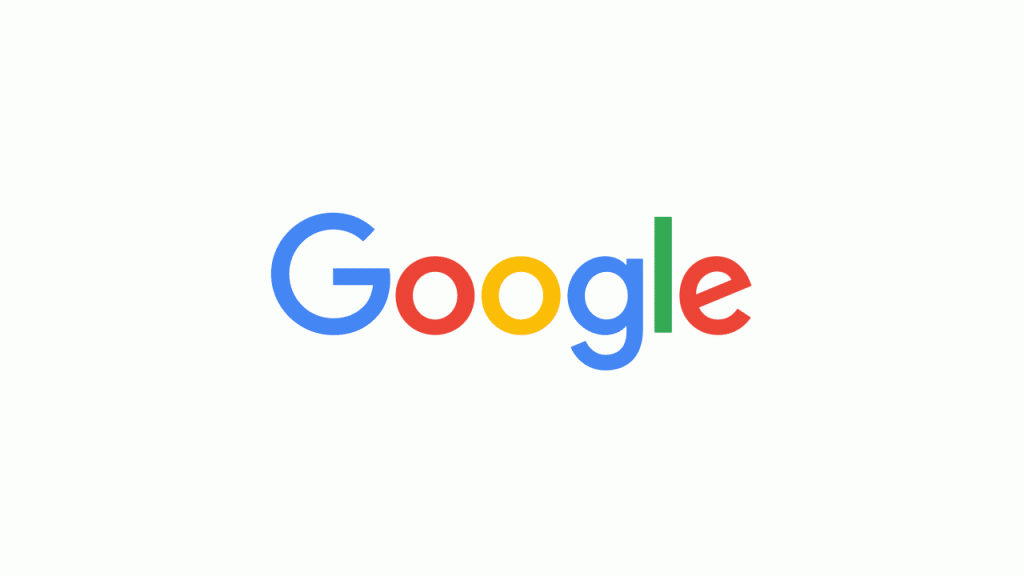
The company ditched its serifs, meaning it no longer uses little curlicues at the end of letters – the new font is more like Arial and less like Times New Roman.
We like the change, and agree that it will be better across all kinds of devices, but the new look has gotten some criticism. Groupon, in particular, is saying that the search engine’s new G is too much like its G. It even asked for $7 million from the search engine for using its logo on Twitter (but we’re pretty sure that was a joke).

What do you think of the new Google logo? We want to know your process for designing a great logo for your company.