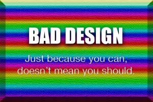
 I’m sure most of you will see this image and be instantly disgusted, for that I am truly sorry. Furthermore, it wounds me to admit that I actually created this assault on the optic nerve specifically for this blogThis term originated as shortened version of “web log” and has come to be known as a regularly updated web-page, often containing news, opinion and personal stories. post. Just know that I did so with the best intentions. I think we can all agree that this image is a pain-inducing example of bad design. Creating such an image was actually quite simple. All I had to do was ignore everything I’ve learned over the years about good design.
Spotting good design isn’t so simple, though. It’s important to know that “good” is a relative term.
As with many things, the key to an effective, compelling design is to know your audience. Believe it or not, there is most assuredly someone out there who doesn’t see anything wrong with this ludicrous image.
Minimalist Design
 Personally I am a proponent of a minimalist approach to design. Minimalism has existed for nearly a century in one form or another, but it has become prolific in web and graphic design in recent years, largely due to huge companies like Apple.
The style has become synonymous with all things modern and has transcended print or digital media, taking shape in the physical world with “ultra modern” interior design and even architecture.
The Principles at Work
 Next we take a look at something on the other end of the spectrum. The ad to the left promotes Electric Daisy Carnival in Orlando. EDC is a musical festival that features electronic dance music like techno or trance. Show this image to anyone that frequents the carnival and they will undoubtedly recount a past experience there. Show it to someone that has never attended the carnival and, if they like EDM, they will get the impression that it’s promoting something they might be into. This is accomplished with the bright vibrant colors. If used properly, color can be very powerful. But as I’ve demonstrated above, a would-be designer with an untrained eye and access to the right tools can create a colorful nightmare.
The same could be said for posters or websites for other genres of music or even those that promote films or television — anything, really. Close your eyes and think about the poster to that horror film that really scared you. I have no idea what film it is, but I bet the poster was dark, with a silhouette of sorts, or maybe featuring a close up of a frightening creature.
In design, there are just things that work, and most people don’t understand why. In the 1920’s, a group of German psychologists developed The Gestalt Principles, a psychological term which means “unified whole.” It refers to theories of visual perception. The human brain instinctively organizes visual information, and the science behind this process is amazing. Great designers know how to tap into these principles to create compelling designs that speak to people at a primal level.
Does your website consider the values of your target audience? Do the visuals of the site reinforce said values? I’ve worked with many clients in my past and one thing I always seemed to encounter was that some clients would fall in love with a design for all the wrong reasons. As an expert in design at Online Image®, it’s my job to ask the questions that inform me about the target audience. It’s the responsibility of any successful business owner to know the answers.

